
A microwebsite, or microsite, is a compact, standalone digital experience created to serve a specific purpose, such as promoting a product, campaign, or event. They are typically a single page ora small group of pages, and unlike a brand’s primary website, a microsite is designed to focus on one clear message or goal.
It often lives on its own domain or subdomain, features custom content and design, and is tailored to engage a specific audience or support a temporary initiative. Whether driving signups, showcasing a story, or launching a product, microsites offer a flexible way to deliver targeted, high-impact experiences separate from a company’s core web presence.
Micro Website vs. Website vs. Landing Page
Understanding the difference between a micro website, a traditional website, and a landing page is key to choosing the right format for your campaign or project. While all three are web experiences, they serve distinct purposes and have different structures.
A traditional website is the main digital hub for a business or brand and typically includes multiple pages to serve a variety of users with different needs.
A landing page is a single webpage designed for a very specific goal and usually has one CTA and minimal navigation to keep the user focused. Landing pages are typically part of a larger website rather than separate from it. They are also often where a person is directed from a paid ad campaign and can be personalized for groups of users.
Finally, a micro website is a small, standalone site built around a specific campaign, product, audience, or event and often includes a few pages or an interactive single-page experience. Unlike landing pages, microsites can live outside the main website and have more freedom in design and content.
Use Cases
Micro websites can be used for a wide range of objectives, including:
Product or Feature Launches: Highlight new offerings in a more immersive, distraction-free environment.
Marketing Campaigns: Run limited-time campaigns or contests with dedicated messaging, CTAs, and branding.
Event Promotions: Build bizz and collect registrations for webinars, conferences, or pop-up events.
Brand Storytelling: Explore a theme or brand narrative through visual storytelling, without being limited by the structure of the main site.
Best Practices
Keep it Focused
One of the biggest advantages of a micro website is its simplicity. By keeping the entire site centered around one clear purpose, you can make the most of your microsite. Everything on your site should support a single goal, whether it's promoting a new product, collecting event signups, or highlighting a campaign.
Start by identifying your core objective, and then design every element to guide visitors toward that outcome. Eliminate anything that could distract from it, including avoiding multiple CTAs, unrelated links, or extra content that pulls users in different directions.
With a focused microsite, users won’t have to think about what to do next. They will land on your page, instantly understand what it’s about, and naturally be led to take action.
Clear CTA
Make your call-to-action obvious, bold, and persuasive to generate the most conversions. Your CTAs should be the focal point of your microsite, no matter what your objective is. Action-oriented language, contrast, and strategic placement ensure that attention is drawn to your CTA buttons, urging visitors to convert.
Placing your CTA throughout the page, in multiple spots if necessary, and ensuring it aligns with your core goal can dramatically improve conversion rates. Focus on your call-to-action buttons as they are one of the most important elements of your microsite.
Mobile-First Design
With such a significant portion of traffic coming from mobile devices, it is critical that your microsite is designed with mobile usability as a priority. Some general areas to focus on when ensuring a mobile-friendly site are fast-loading images, tap-friendly buttons, and minimal scrolling friction.
Responsive design ensures the experience feels high-quality on all screen sizes. Simplified forms and thumb-friendly CTAs can help keep engagement high when it comes to mobile users.
Simple Navigation
Because your micro website should be focused on one clear objective, you most likely won’t need a full navigation menu. Too many navigation options can cause user confusion and drop-off, so sticking with a single, scrollable page, or one or two well-labeled sections is usually enough.
The goal is to guide users toward a conversion rather than distract them with unnecessary links. Keep your layout clean, content linear, and the journey obvious. In many cases, the only navigation a user needs is a smooth scroll and a big button.
A/B Test Your Microsite
Testing the different elements of your microsite is one of the most impactful ways to increase conversions. A/B testing gives you insights into your unique microsite users and what specific changes they will respond to. You can test everything from headings and CTAs to page layouts and navigation to make data-driven decisions to increase conversions.
With Compose, you can quickly launch A/B tests without coding and pay for only the tests you run, making it ideal for focused microsites or short-term campaigns. Whether you’re testing different product descriptions, signup flows, or CTA language, Compose makes it easy to optimize fast and improve results with real user data.
3 examples of good micro websites
Blueheart by Patagonia
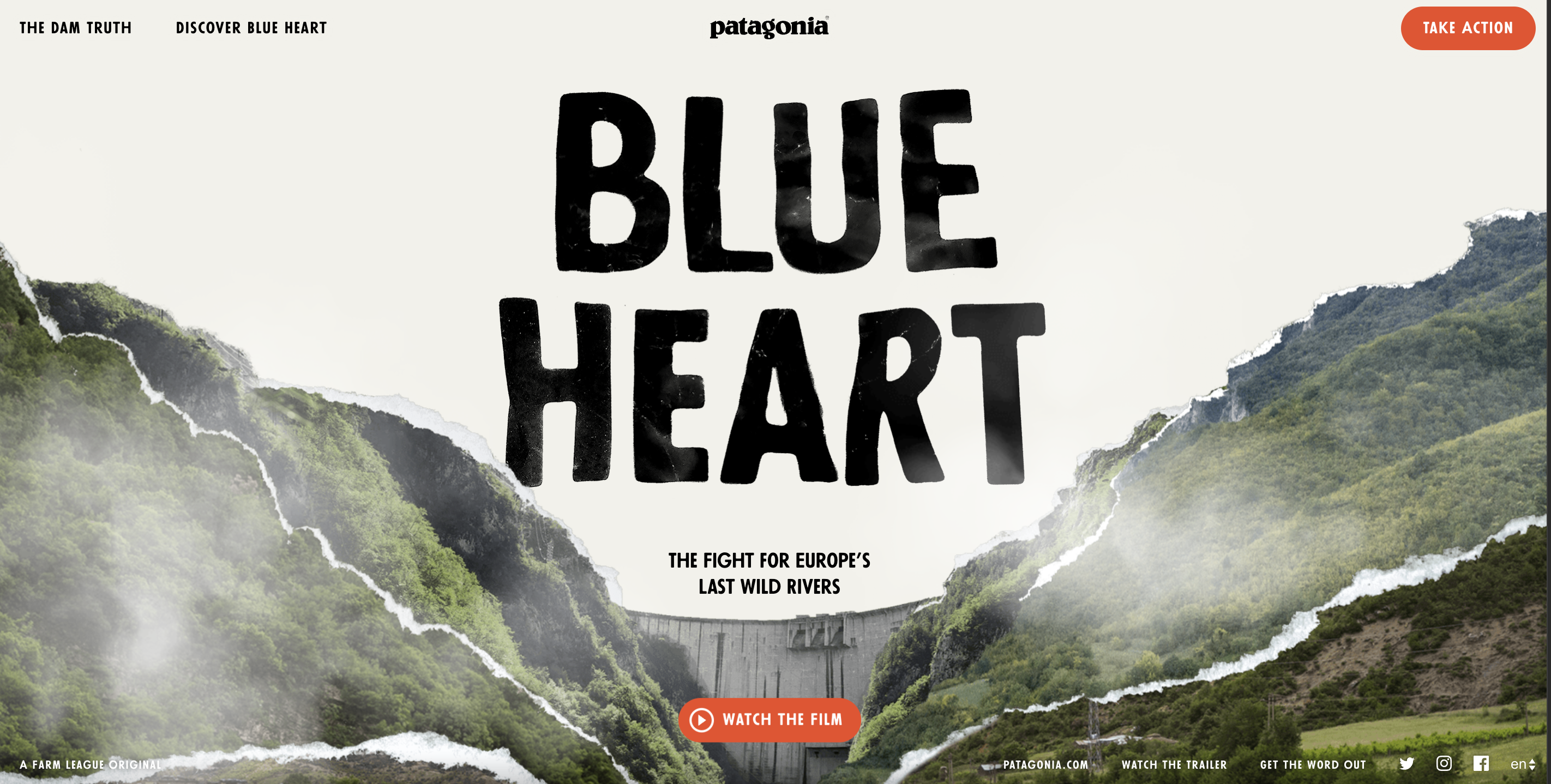
This microsite is laser-focused on one mission: to protect Europe’s last wild rivers. Instead of promoting products, Patagonia uses this micro website to raise awareness, build a movement, and drive action.
Why it works:
Single CTA: The site pushes users toward watching the documentary and signing the petition.
Clean layout: No extra navigation, just compelling visuals and purpose-driven storytelling.
Mobile-friendly: Optimized for both education and action across all devices.
Chipotle: Real Foodprint

This campaign microsite highlights Chipotle’s commitment to sustainability and the farmers who make it possible. It invites users to explore their food choices through personalized data and real stories.
Why it works:
Mobile-first design: Smooth interactive experience that works seamlessly on all devices.
Focused storytelling: No clutter, just powerful imagery and farm-to-table messaging.
Strong visual identity: Earth tones and real imagery align with Chipotle’s brand and mission.
Life at Home by IKEA

IKEA’s microsite takes a deep dive into how people live in their homes, offering insights, stories, and inspiration rather than just products.
Why it Works:
Simple navigation: One-page scrollable experience segmented by home themes.
Data-driven UX: Uses research to present relevant, compelling insights.
Soft CTAs: While not aggressively salesy, it still supports IKEA’s brand and funnel by guiding users to explore ideas and eventually products.
Conclusion
Microsites are a powerful tool for delivering focused, high-impact digital experiences that cut through the noise. Whether you’re launching a product, promoting a campaign, or telling a compelling brand story, microsites allow the flexibility to create something tailored, immersive, and goal-driven without the constraints of your main website.